On March 28th, I had the experience of participating in a vigil remembering the Asian lives lost in the shootings in Georgia. The moment itself was an incredible moment of unity and love in the Kansas City community. Not only for the AAPI community, but the community as a whole of people of all colors. Even with the rising hate against AAPI community during this pandemic, and the possible danger of attending this gathering, I was definitely glad I went. Love definitely trumps hate.
But in the spirit of this site, wanted to talk about something a little different. In the time leading up to the event, the organizers encouraged those attending to make signs, and I definitely wanted to make something awesome.
As for what that “something” would be, well, that definitely was the question. But so much of my life has been exposed to art, which included contemporary Korean artists to, much like everyone else, strong fandom with manga and anime. And that energy and exposure has, without a doubt, impacted my own work, and I definitely wanted to make a sign that reflected that energy that’s influenced my life.
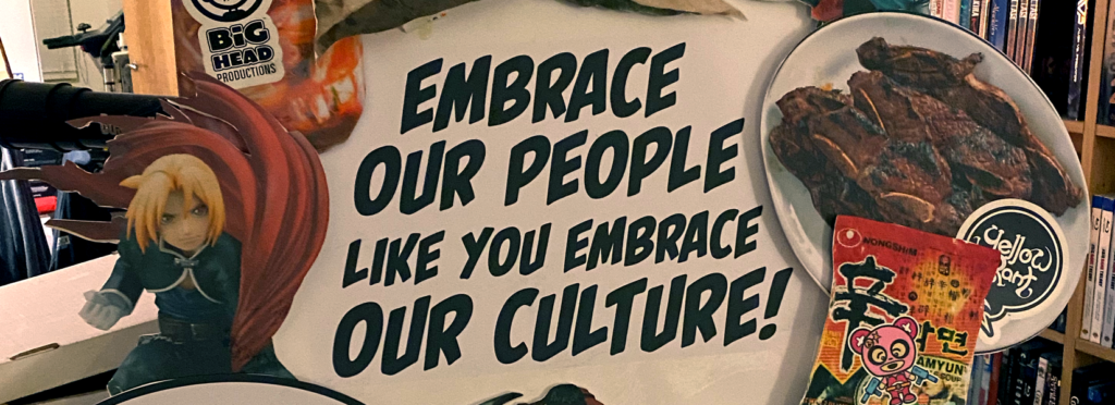
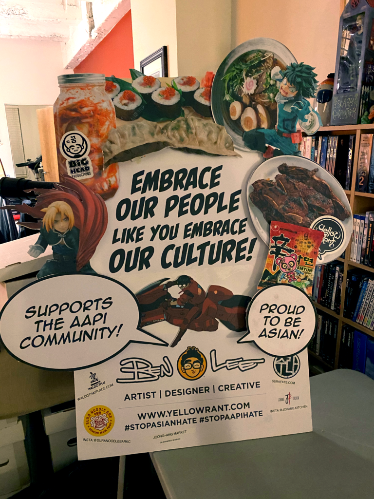
It’s funny, it’s not often when the concept comes to mind so quickly. But given the world we’re in, it seemed simple. With people attacking the AAPI community, I’d bet those very people are fans of our culture. Even if it’s at a surface level, like our food & pop-culture, I’d bet they embrace it & enjoy it. So it seemed obvious the messaging would simply be, “Embrace Our People like You Embrace Our Culture!” and fill that will images of food and pop.
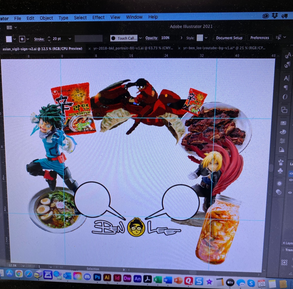
As I started the layout, I originally was thinking a 24×36 sign in a landscape format. You’ll notice elements breaking that size. The idea there was a memory of an artist as a kid. Growing up, my Dad owned and operated a gallery/framing shop. And I remember one time visiting as a kid, there was a piece being framed where elements of the art was lifted to create this depth to the illustration. I don’t remember the artist’s name, but it definitely left an impact. But if you’re curious about the art itself? My memory of it was a large cityscape, cartoony, like something you’d find in a HIGHLIGHTS’ magazine at the dentist’s office.
But that layered depth was something I definitely wanted to try here.
First up, after laying everything out, printing out all the elements and mounting them on foamcore. I’d lift the elements with foamcore struts too, all adhered with hot glue.
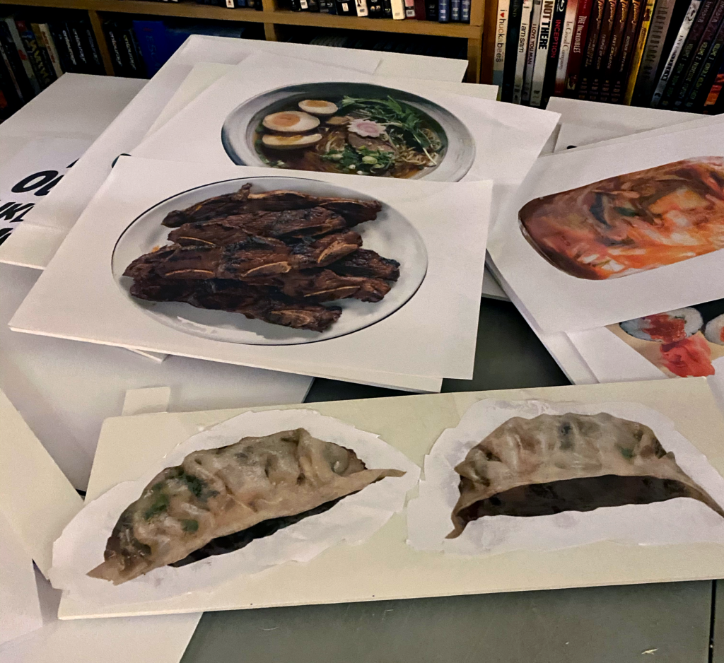
After a TON of hot gluing and few burns, got the sign together…
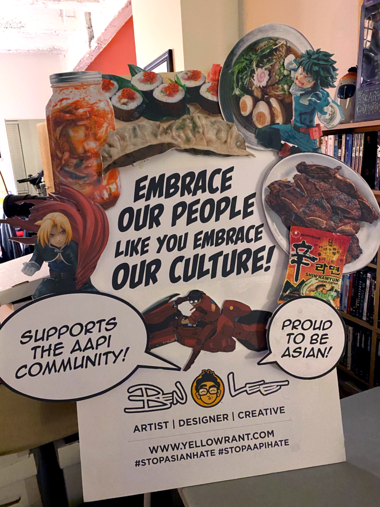
I think if I had to redo the sign, I’d make the struts longer to greater larger shadows. But you’ll notice it went from a landscape orientation to a portrait layout. Just one of those problem solving things you have to sort in the process of making.
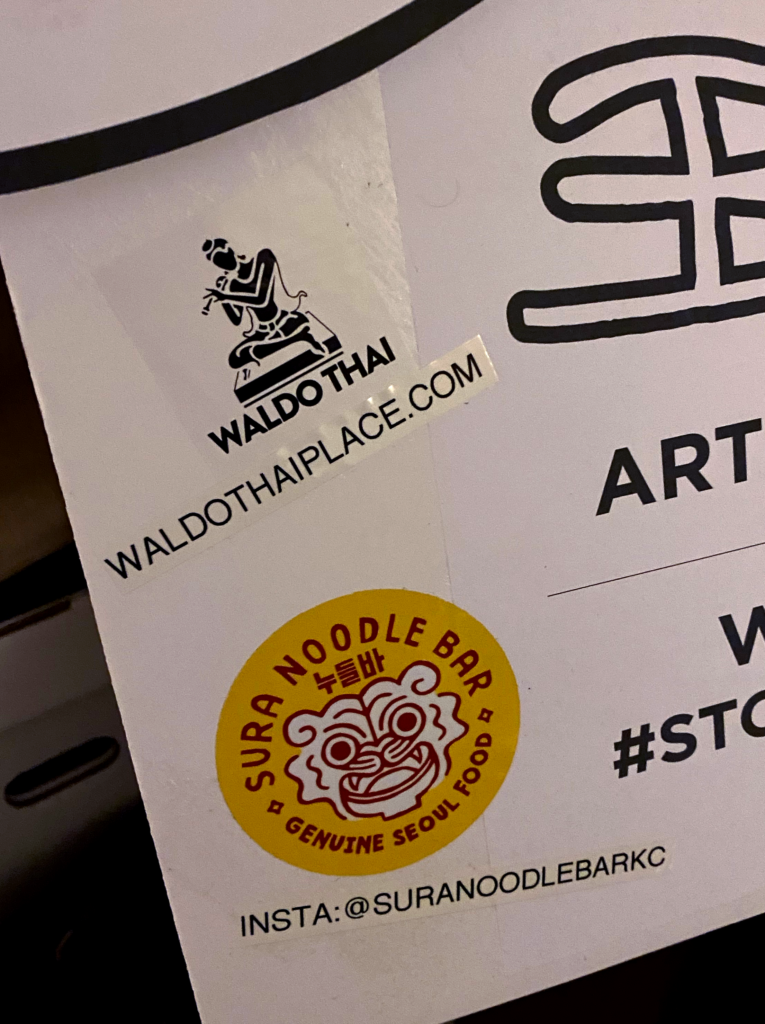
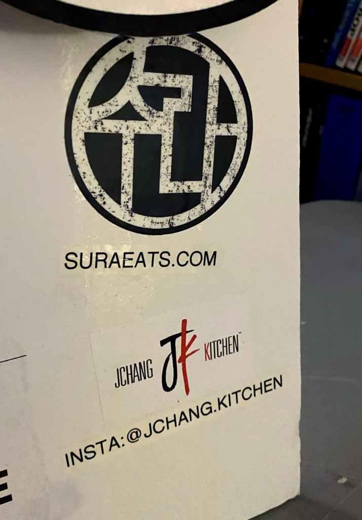
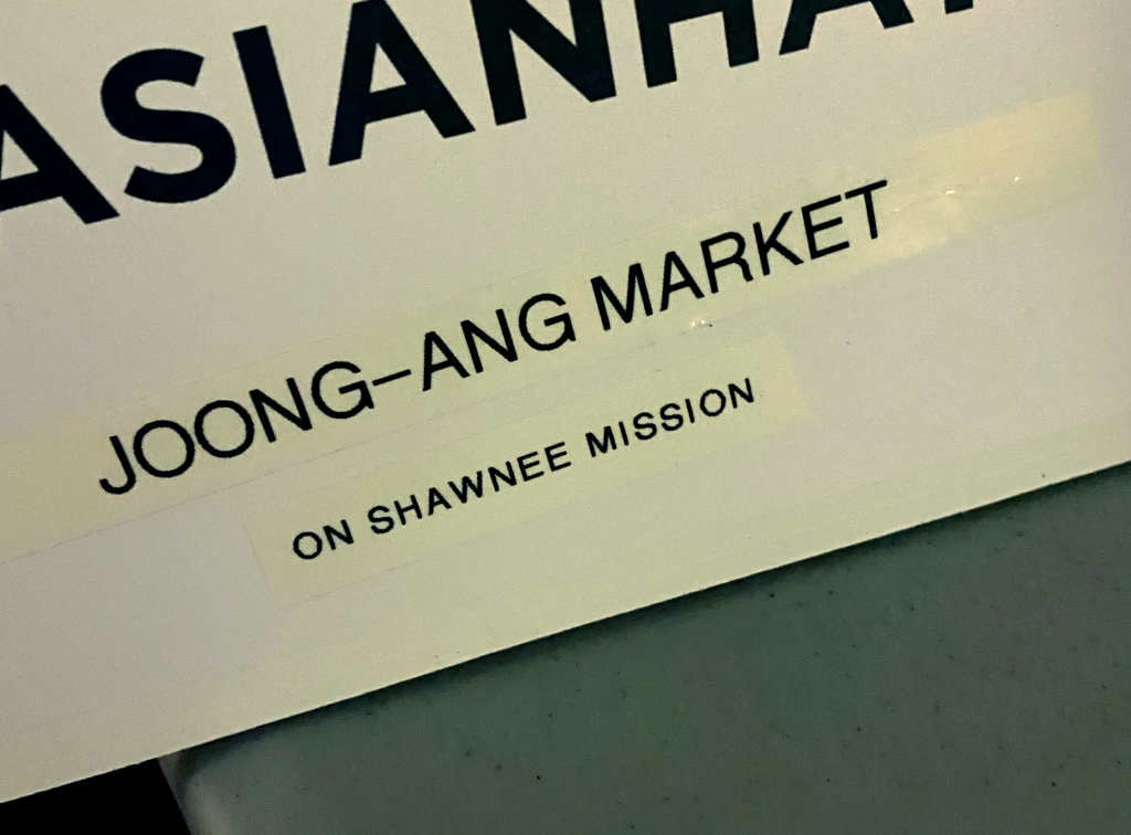
Though one thing I wanted to add were Asian owned businesses in the area. So definitely reached out, asked permission, and added shops of owners I’ve gotten to know over the years.
And with that, comes the final sign…
If you’re wanting to read more about the vigil itself, check out The Pitch and Kansas City Star for their write-ups about the gathering. I hope you’ll check them out.